Resilience
Resilience is a cyber-risk company on a mission to make the world cyber resilient. I helped extend its brand and built the scalable icon library that now powers its UI, social, and product design.
The Challenge
As Resilience scaled, its visual language was fragmenting. Teams across UI, product, and social were each sourcing or drawing their own icons, so the same cybersecurity concepts looked different everywhere — inconsistent, off-brand, and slow to produce.
My Role
I joined as the company refreshed its brand and helped refine and extend that new identity into everyday use. Working alongside another designer, the social media manager, and the VP of Marketing, I owned the systems work that kept everyone visually consistent.
What I Built
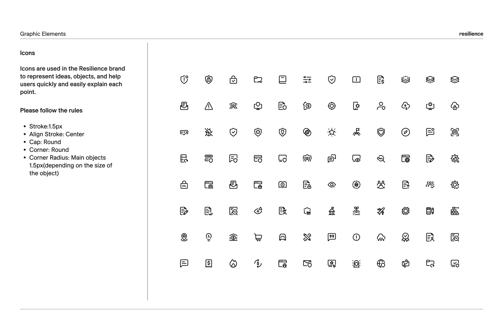
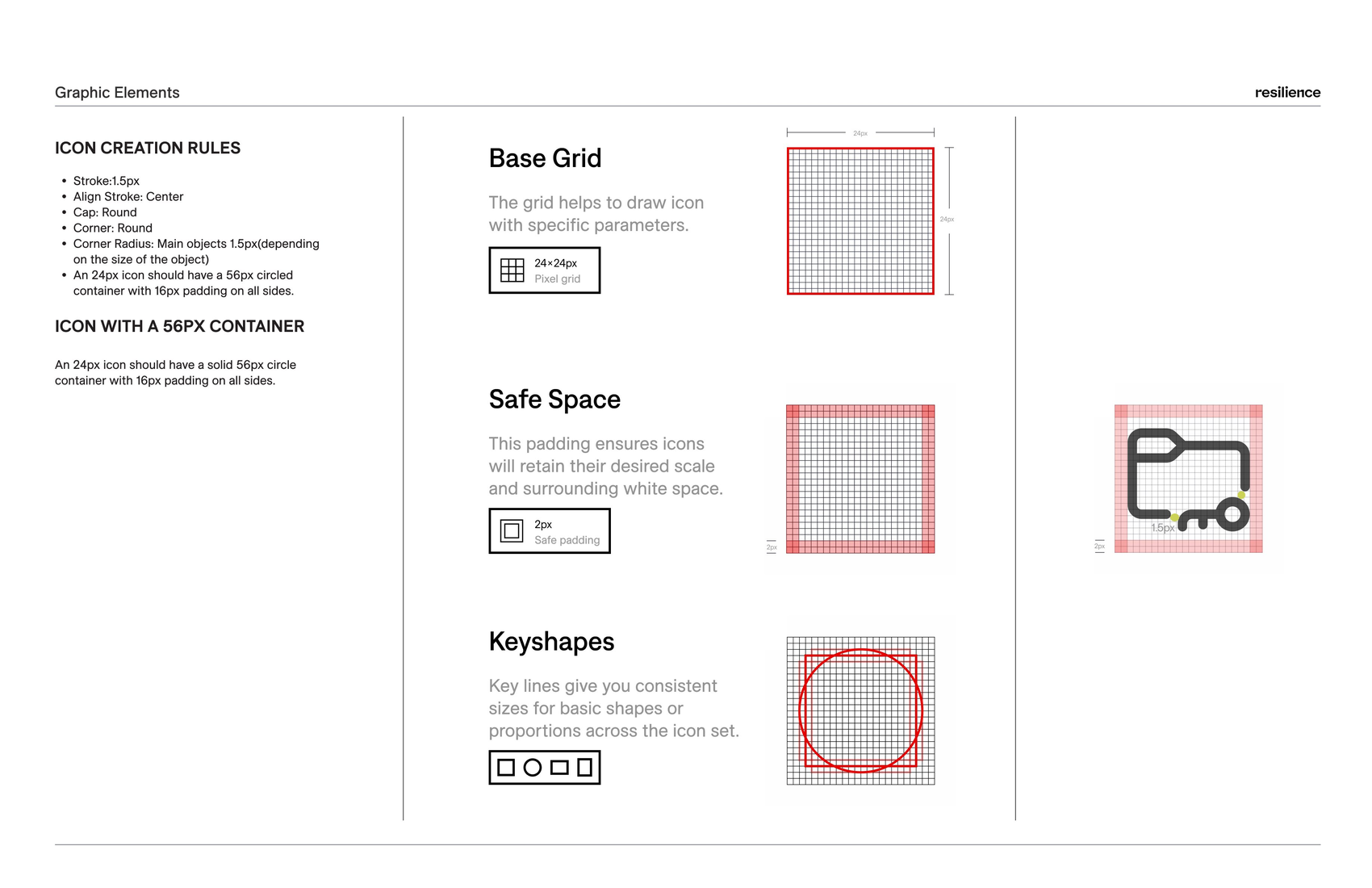
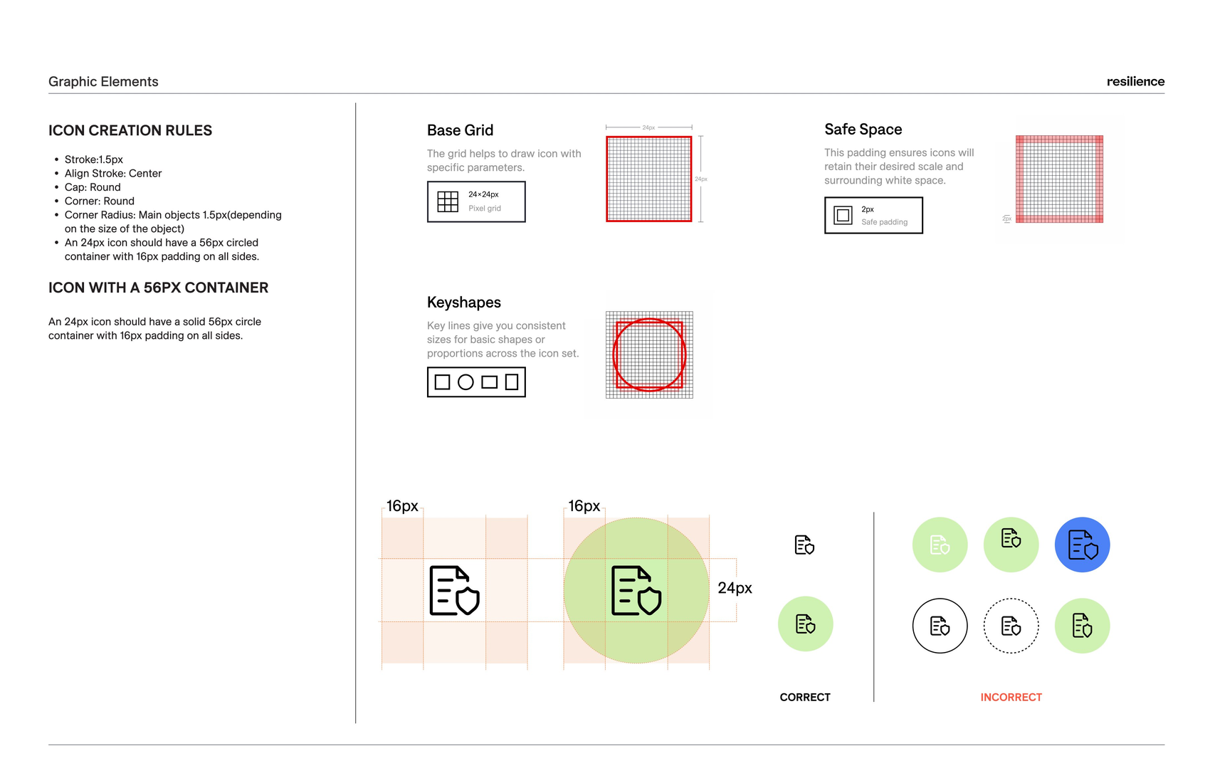
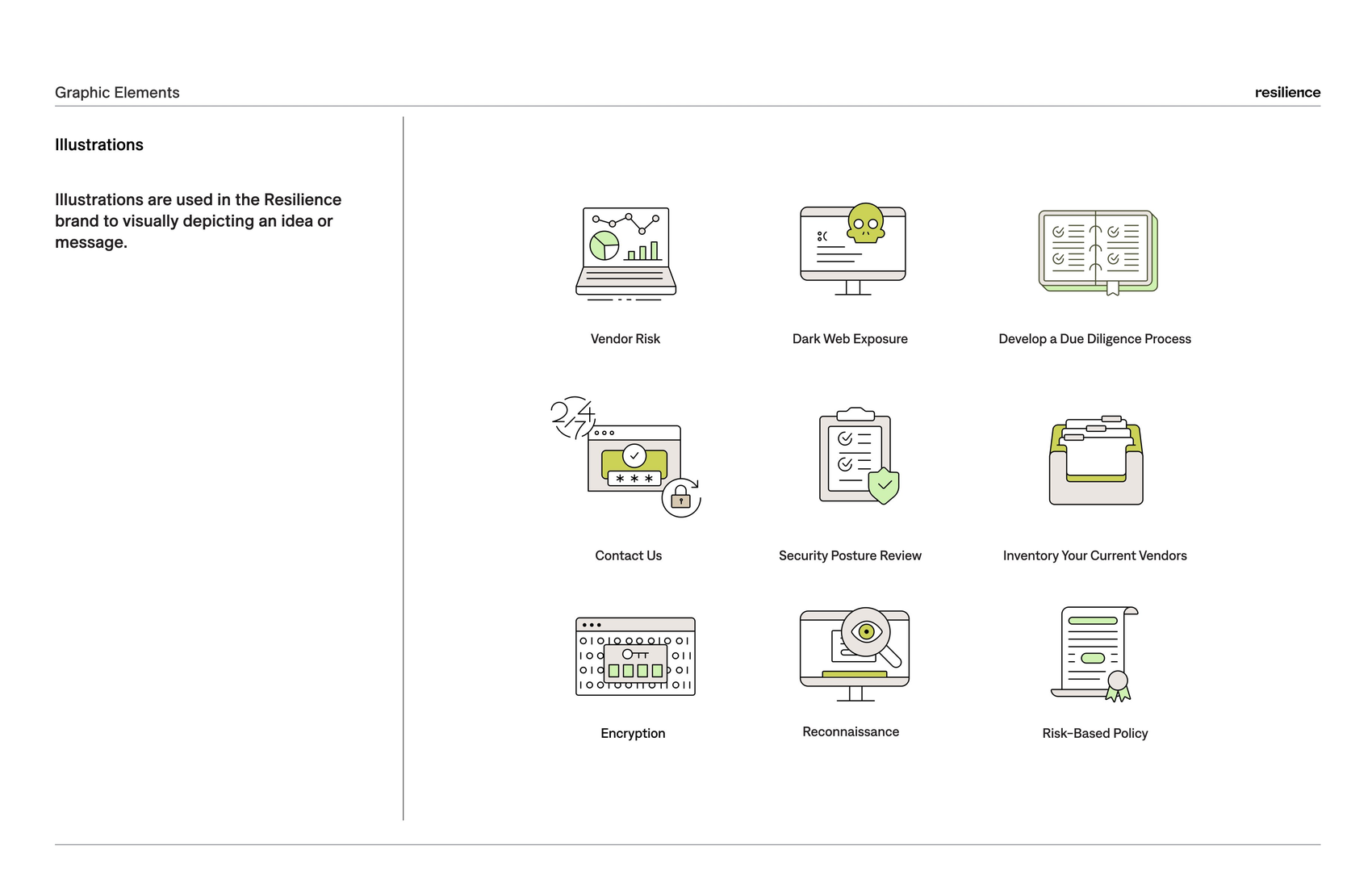
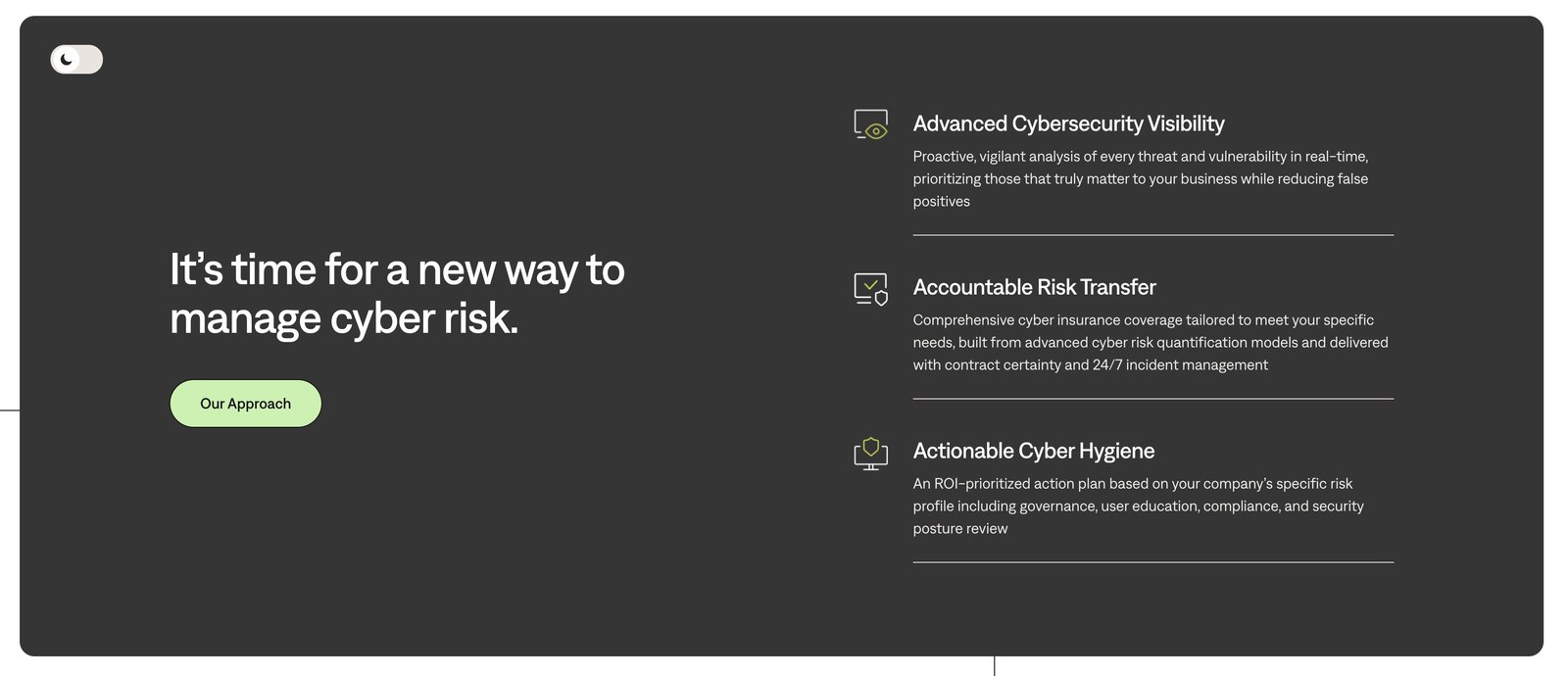
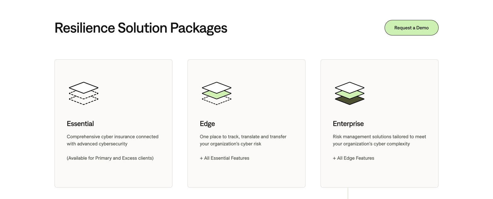
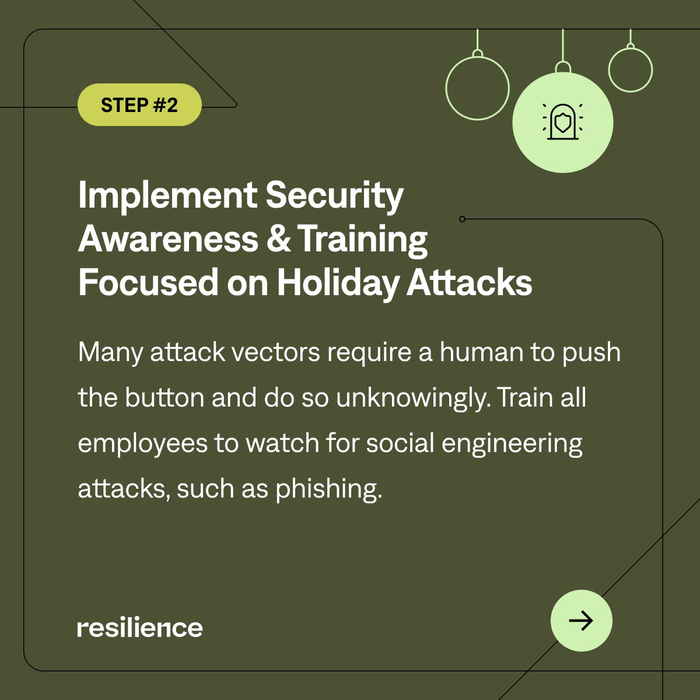
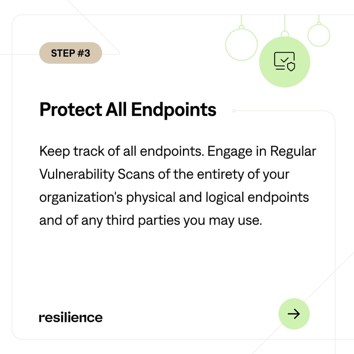
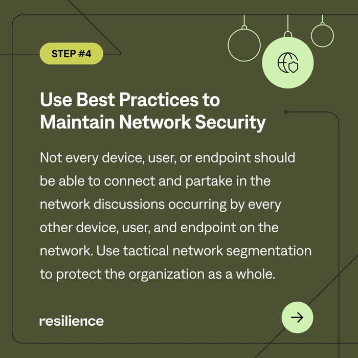
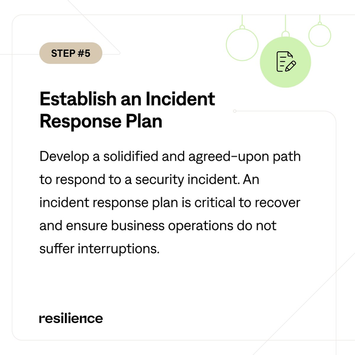
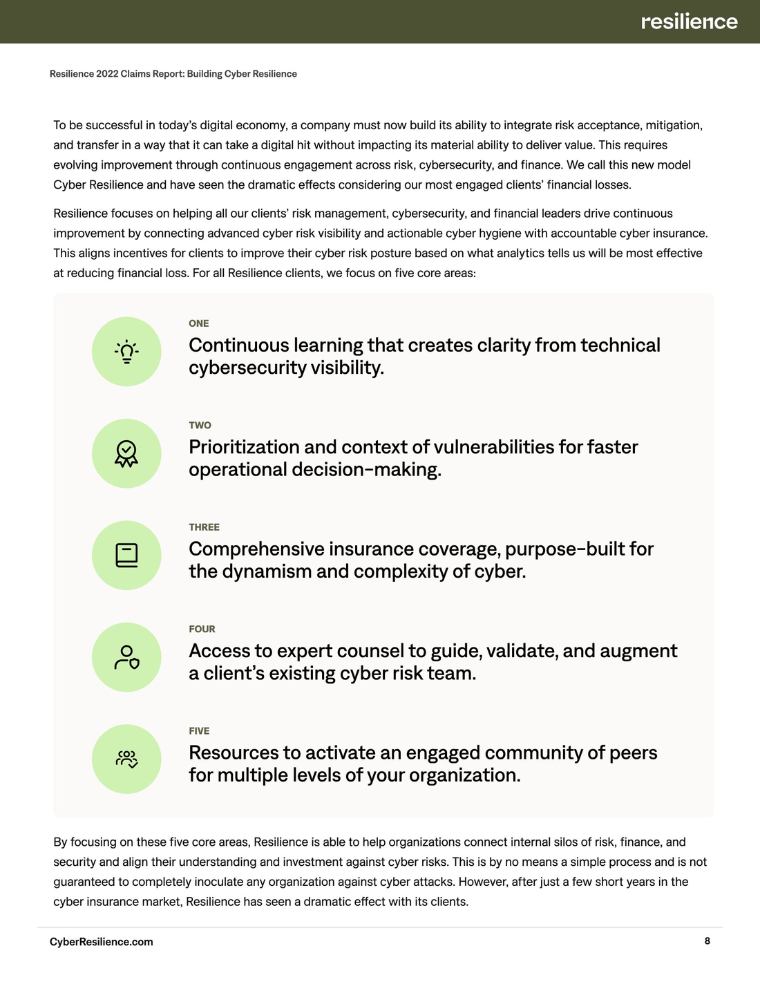
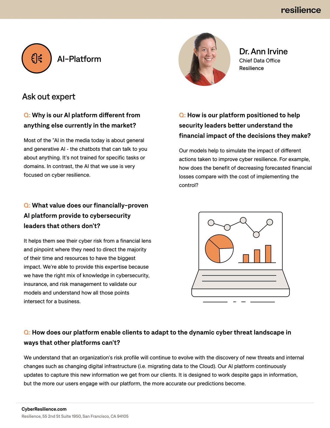
A single, scalable icon library — 100+ icons covering complex cybersecurity concepts. Built in Figma to one consistent grid and style, the set stays crisp at every size and serves UI, product, and social from one source of truth.
Beyond the Icons
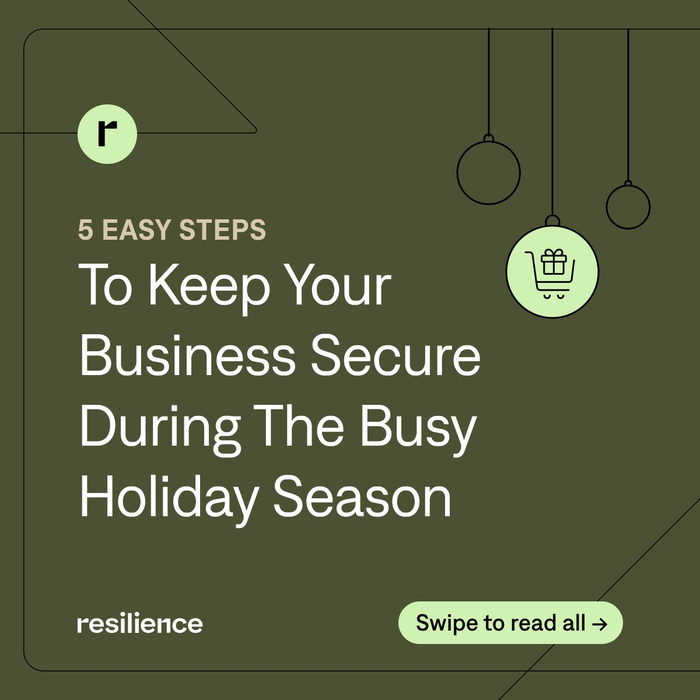
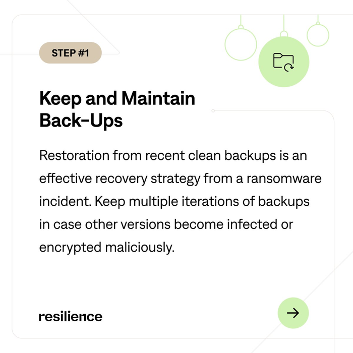
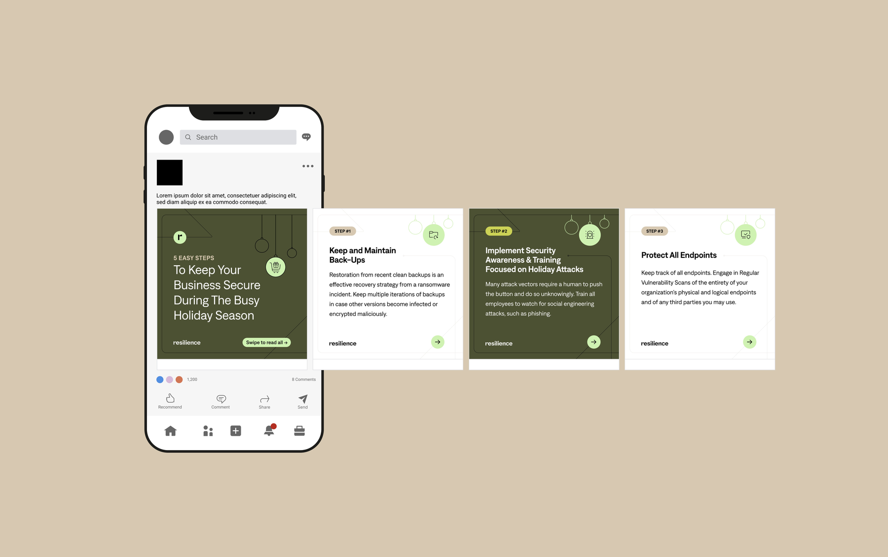
I also created the motion piece that ran on-screen at our tradeshow booth, and built reusable video templates that let the team produce on-brand motion fast. Day to day, I partnered with the social media manager on LinkedIn content — images, GIFs, and short motion shipped on a daily cadence.